Custom Popular Post Widget with Sliding Color Effect
Custom Popular Post Widget with Sliding Color Effect
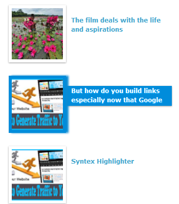
I just come with another Popular post widget which I named Popular
Post with sliding Color effect. In this widget you will see an extra effect on
Popular post title on mouse over. When a user mouse over on Popular post image
then a sliding color will be visible behind the post title. And after release
the mouse from post title then the effect will disappear. Among various popular
post widget effect this is pretty cool and you will love it. For adding this
cool popular post widget just follow the below steps-
Step 1 Log in to your Blogger account and Go
to your Blogger Dashboard
Step 2 Go to your Layout tab.
Step 3 Click on "Add a Gadget" then select "Popular
Posts" Widget.
Step 4 In configuration window check image thumbnail option
only. And set the number of posts that you want to display.
Step 5 Now click on Save button.
Step 6 Now go to Click on -> Template -> Edit
HTML
Step 7 Now Find this code ]]></b:skin> by pressing Ctrl+F (Windows) or CMD+F (Mac)
Step 7 Now Find this code ]]></b:skin> by pressing Ctrl+F (Windows) or CMD+F (Mac)
Step 8 Paste the below code Before/above ]]></b:skin>
/*--Widget by www.bloggerspice.com--*/
.PopularPosts .widget-content ul li .item-thumbnail img{
padding: 5px;
border: 1px solid #FFFFFF;
-webkit-box-shadow: 0 1px 2px rgba(0, 0, 0, .4);
-moz-box-shadow: 0 1px 2px rgba(0, 0, 0, .4);
box-shadow: 0 1px 2px rgba(0, 0, 0, .4);
width: 100px;
height: 100px;
z-index: 99;
position:relative;
background:#fff;
-moz-box-shadow: 0;
-webkit-box-shadow: 0;
box-shadow: 0;
}
.PopularPosts .widget-content ul li:hover img {
background:#008CDB;
-moz-box-shadow: 5px 0 3px #088BD5;
-webkit-box-shadow: 5px 0 3px #088BD5;
box-shadow: 5px 0 3px #088BD5;
border: 1px solid #088BD5;
}
.PopularPosts .widget-content {
background:#fff;
padding: 0 10px;
}
.PopularPosts .widget-content ul li {
position:relative;
}
.PopularPosts .widget-content ul li .item-title {
position:relative;
left: 5px;
top: 20px;
z-index: 1;
}
.PopularPosts .widget-content ul li .item-title a{
-webkit-transition: all 0.5s;
-moz-transition: all 0.5s;
transition: all 0.5s;
text-decoration: none;
color:#3FA5CD;
text-shadow:1px 1px 1px #fff;
}
.PopularPosts .widget-content ul li:hover .item-title a{
color:#fff;
text-shadow:1px 1px 1px #04AFFF;
}
.PopularPosts .widget-content ul li .item-title:before {
left: 30px;
display: inline-block;
position: absolute;
content: "";
width: 0px;
height: 100%;
-webkit-box-shadow: 0 1px 2px rgba(0, 0, 0, .4);
-moz-box-shadow: 0 1px 2px rgba(0, 0, 0, .4);
box-shadow: 0 1px 2px rgba(0, 0, 0, .4);
position:absolute;
-webkit-transition: all 0.5s;
transition: all 0.5s;
z-index: -1;
background:#008CDB;
}
.PopularPosts .widget-content ul li:hover .item-title:before{
width: 90%;
}
Step 9 Finally click on Save template button.
Customization
To see
your new popular post widget with sliding color effect visit your Blog. Final output will be like above image. I hope
you would like this widget. If you need further customization then feel free to
leave a comment below.


2 comments